Graphic design is about as energetic of a field as any art form – always changing and developing, while certain styles remain “classic” and “always in.” I paused my normal hectic schedule of graphic design work to reflect on this today so I could offer you a few graphic design trends that are currently “hot.”
Graphic Design Trends
1) Versatile Design
Today’s marketing isn’t just billboards, posters, and pamphlets. It’s web, mobile phones, digital signage, videos and environmental designs. The best ad campaigns include versatile graphic design that is recognizable across both the old and new advertising spaces: print and digital. It’s important to design with the “repurposing” in mind. For the most part this means formulating a clear focused message that can be relayed large or small and with either few words or lots of copy.
Everyone sees the Geico gecko on the TV ads, and then driving down the highway, there he is waving from a billboard; and he’s on the website; and I’m sure he’s on the app, I just haven’t checked. Simply put – that’s repurposing: a versatility that is consistent and easily recognized across the board, including today’s ever changing new media.
2) Large Web Design
Here is an example of that versatile mind set in practice.
Today’s websites often opt for a more straightforward, tastefully larger approach. Why is that? Larger is more popular simply because electronic devices are smaller: mobile phones, iPads and other tablets. Big buttons, large banners all make it easy for the growing number of mobile internet users to easily navigate and convert on a website. Can’t read it? Gone. Just like that.
There are mobile versions of websites that load automatically when they detect usage by a mobile device, but more often the company doesn’t have a separate mobile site in the budget. In my opinion I find most mobile sites to be handled as if they were hindrances or afterthoughts anyways. I’m generally feel unfamiliar how to navigate them. And perhaps what I find most aggrevating, what I’m looking for usally didn’t make the mobile content cut and is unavalible for the mobile site. This is why I usually opt to “view the full site.” Fortunately this is all avoidable with a little preplanning on the designers end. He or she will have mobile, tablet, and desktop users in mind while opting to create larger more prominent features. Plain and simple, or shall we say, large and in charge.
3) Conceptual Design
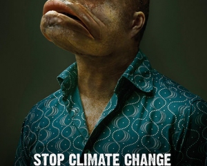
 An incredible amount of effort is put into the idea/concept compared to just designing to market a particular product, service, low price, best quality, location, etc. Conceptual design is meant to abruptly stop the magazine page flipper in there tracks. It means formulating concepts and creating visuals that evoke human response. They will often pull heartstrings (emotional), tickle ribs (humor), or drop jaws (informative).
The idea behind this approach of design is that the message is louder than the design itself – it’s thought provoking and makes you interpret the message. Conceptually designs are particularly evident in nonprofits. Visit adcouncil.org for several phenomenal examples.
Moving on…
4) Informative Design
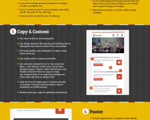
Mainly, infographics: popular new design work explaining a simple or often complex study of some sort. For examples, take a look at Cowley’s Pinterest Board “Great Infographics.”.
 These are especially popular among SEO’s (search engine optimization specialists) because they are highly effective pieces of link bait effective in producing a ton of back links for the website who publishes them. What does this mean? (For a refresher on SEO, see our blog posts about it.) I share something interesting on the internet, then people will copy the link to that object and share it all over social media and other websites, bringing immense amounts of traffic to me via this image. It’s done all the time and is extremely effective. These things go viral. See how many we got being passed around on Pinterest for example.
There are definitely the good, bad, and ugly among infographics; but the simple vector style artwork is mesmerizing and extremely easy on the eyes. The ones that are most effective show and don’t tell. There are some terrible ones that just list stats. Some are truly awful, as in all “art.”
However, in broad brush strokes, we are speaking about that kind of design, not necessarily “infographics” per se: the long blocks of design shared on Pinterest and the like. Rather, we are speaking in broad terms of the style of the artwork. These graphics are recognizable with their very strong vector style and limited color palette. The result can be a thing of beauty. It reminds one of the intro to a Pixar movie (think Monsters, Inc.) or perhaps the opening credit sequence in Spielberg’s Catch Me If You Can. It’s the designer saying: “I’ll tell you all about it, but in pictures.”
Cowley recently did a beautiful website redesign for InnerActive Wellness and employed some stunning yet simple infographics-esque images to explain what the company was all about. We also animated them to give them that extra spark. Take a look at the website design for yourself here.
5) Typographic Design
 Typography reaches far beyond the font list under the type menu on the computer. It is far too easy to simply type out words, choose a typeface and go. Typography encompasses the reality of effective design. It dictates the success in the design’s identity. Fonts can convey a message themselves. They have personalities, characteristics, and can either take the design right on track or down a road that you don’t desire.
The sheer number of fonts available today is simply out of this world. 10 years ago, there were just a couple hundred or so to work with. Today, new fonts are produced without end every single day; and via the ever more open source (internet), they are shared for all to use. So choose wisely.
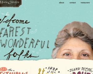
In some case typographic design can make up an ad in itself. With some time and effort put forth to the layout, manipulation, texturing, shadowing, and/or simply concentration on good typography practices, a really powerful ad can be created. Below are some examples of some really cool typographic designs.
In Short
The possibilities are endless as the design world travels on. I hope these trends will help inspire your work in the future.
Feel free to add other modern design trends below or comment on the ones above. I love feedback!

