
Our Website Is Now Using Responsive Design
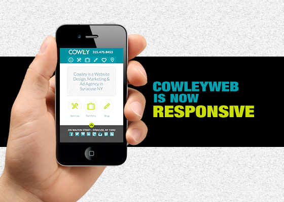
About 20% of the traffic to our site comes from mobile devices. Previous to this week, they were presented with a site designed for desktops. This meant a lot of pinching and zooming to navigate around, and ultimately a semi-frusterating experience. Our site is now using responsive design, meaning that the site will respond to your device's width and adjust the content accordingly. You can try it on your phone now, or by simply shrinking your browser width wise to see the new look. Rearanging The ContentOur site uses many different formats that don't translate one-to-one on mobile. For example, our navigation at the top is way wider than the screen of a phone, and if we were to lay the items one on top of the other it would take up much of the phone's space. To solve this problem, we are showing icons when you are on your phone. Another thing that doesn't translate well is the left menu that you see in the blog and the portfolio. This would be way to big, so we are hiding it on the phone, making navigation a little trickier, but still doable. We are also hiding some longer blocks of text and our front page slider as these didn't visually translate well enough. Why Didn't We Just Make A Mobile Site?Mobile sites can be useful if there is static content that won't change. Our site is changing all the time, blogs are being added and new work is arriving in our portfolio constantly. If we had a separate mobile site, we would have to post this content twice. The beauty of responsive design is there is only one site to update where the mobile css styles are applied based on the width of the device viewing it. Simply put, the content is added once and knows how to look on a phone and a desktop at the same time. Should I Make My Site Responsive?Probably, but it isn't exactly needed for all sites. Our designs are becomming larger to look good on phones and desktops so a true responsive design is not always needed. Responsive sites take more time, and therefore more money, so sometimes this option is not required for smaller budgets. However, if you have the time and money, it is probably worth it. More people are using their phones to view your webpage every day and more of them are expecting your site to be presented in a mobile friendly way. |
Stay InTOUCHSign up here to get our monthly newsletter and blog updates. |