Recently at Cowley Associates, we were tasked with a rebrand initiative that really brought out the best in us.
The client, formerly known as The Biomedical Institute of America “Innovators for the Health and Medical Field,” needed a new name to reflect their mission, vision and values and really bring them into the 21st century.
The Creative Workshop
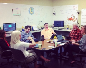
Our creative team got right to it. We compiled three pages of possible names for the organization, narrowed it to our top five, and presented those to the company. They chose three.
From there we came up with logos and taglines for their picks and submitted those to the Institute’s internal focus group. The result (well, it’s obvious from the title) was Red Sky.
The tagline we coined is “Inventions Realized,” - "a cool name given what they do,” said Tracey Gregory, our Project Manager for the Red Sky Project.
Paul Cowley, our CEO and Creative Director, had this to say about the project:
“The client came to us with a very institutional, academic name, while the actual company itself is agile and innovative. They wanted a name that captured the imagination of technologically minded people, inventors, and progressive thinkers. They wanted something meaningful and energetic. Red Sky is simple, clean, easy to remember, and above all – progressive!
 The New Realization
We developed the corporate ID package as well as PowerPoint templates. The client ended up picking the option that was most “outside the box” which we loved because we are “outside the box” thinkers as well, affirming the fact that they really are “Innovators,” something that will now automatically be sensed by clients with their new, on purpose look.
“It was definitely a team effort, getting all this together,” Tracey mentioned, “I am just really proud of it because it ended up being innovative just like their company is; and they were able to appreciate our creative process.”
“I think Red Sky really allowed our designers to do what they do best,” said our Art Director, Jesse Clayton, “They trusted Cowley's vision and never overanalyzed the creative. In turn Red Sky has come away with a super clean, sleek, modern, eye catching, and memorable corporate identity.”
“We are looking forward to an ongoing relationship with the company as they continue to grow,” said Gregory. And thanks to Cowley, they will have a “red sky at morn.”


