
Inside the Design: CenterState CEO Website
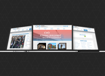
Cowley recently finished a complete overhaul of the CenterState CEO website. We gave it a brand new design, integrated it with the Drupal Content Management System, and introduced a whole new user experience that makes the site easier and faster to use. Click on a “+” sign to learn more about our thought process behind some of the website’s design elements and insights on how the site functions. A full text transcript can be found below. (Currently this interactive presentation is not viewable on phones) Simplified NavigationIt was important going into this web redesign that we take the time to plan and think deeply about the site’s page structure and navigation. It’s important from a user perspective to be able to easily find information within 2 clicks or less. We were able to streamline CenterState’s content into 5 main categories to keep things clear and organized. 5 is a nice round number that doesn’t overload a user, and still gives ample room in case a new menu item is needed in the future. With this new navigation, users will be able to clearly identify where to look for the information they need, and for CenterState, it will narrow their focus when continuing to add content to the site. Header Image & TextA good portion of the “above the fold” design is this large image and bold message. The image changes automatically upon different page loads, and very clearly represents what CenterState CEO is: Economic Development & Business Leadership. A first-time user to the website needs to understand the purpose of CenterState in an instant. So, we created this headline to encompass what they do from a broad level in just one line. This portion of the site also introduces a light red gradient from the CenterState blue to give the site a pop of color and energy. The gradient provides subtle, yet very noticeable, warmth to the design that is pleasing to the eye. The image is also 100% width (along with the backgrounds), which makes the site look current, and works well for the responsive design and functionality. Rotating News & EventsIt’s important that CenterState’s audiences stay up to date on all of the information, events, and offerings within the organization. So, we included a rotating News & Events section that scrolls through the most recent news stories and the upcoming events. With this feature, returning users to the site can stay current on what’s happening. These news and events are also completely self-managed by the CenterState CEO team because we built the site using the Drupal Content Management System. Staggered PhotosIt would be nearly impossible to encapsulate everything that CenterState CEO is in just one image, so we had to find a creative way to introduce more photography into the site. We came up with this staggered/panel look on top of a dark gray background. This effect really allows the photos and the colors in the photos to pop off the page. Scrollable Focus AreasCenterState has core areas that they are focusing much of their efforts: Business & Economic Development; Innovation & Entrepreneurship; Economic Inclusion; Research, Policy, & Planning. We wanted to bring an extra focus to these initiatives, but take up minimal space doing it. So, as a user scrolls across the icons, the title appears. And, once clicked, a visitor is sent to that dedicated page to learn more about what CenterState is doing on that topic. Arrow ElementAs a user continues to scroll down the page, they’ll notice subtle arrows. The arrows have a two-fold purpose: 1) signify movement forward and 2) lead the visitor. So much of what CenterState does is help grow the local economy and move it forward in a positive direction. The arrows subliminally hint at that and involve another element of movement to the site. The arrows also are there to lead the user down the page. The mind naturally follows arrows as directional points, so by adding them down the page, we give the user a set path of information to follow. Call to ActionsThe arrows on the page ultimately lead a user down to “Ways you can get involved…” and these are the main call to actions we want someone to do on the site. The call to actions use the green color we’ve used for other buttons on the site and give a user just three options. This simplifies their choice and increases the likelihood they’ll complete the goal we’ve set for them. Footer With Easy Access PagesAt the bottom of the website is the footer, which will be carried throughout the entirety of the site. This allows a user who has made it to the bottom easily find contact information (which was also at the top of the page), a specific page within the site, or access the new and improved business directory with the click of a button. |
Stay InTOUCHSign up here to get our monthly newsletter and blog updates. |