Web Design Trends That Will Take Over 2016
Every year web design continues to evolve and change as technology improves and designers like myself get more creative with what we can do in the digital space. A website, for many companies, is no longer just a digital brochure that has the “Yes Ma’am” facts with a phone number attached to call. No, websites have turned into entertainment experiences that not only must please the visitor, but also deliver hard business results. Everything on a website has to have a purpose, whether it’s to drive sales or it’s there to inform. So, in turn, every design element has to have a purpose. It could be to catch the eye or have the user follow a certain path to conversion. Web design isn’t just about aesthetics, there’s a level of science and human behavior we designers must consider when we build our layouts and designs. So, for those reasons, here are some trends that I think will completely take over the web design world in 2016: #1: Subtle InteractivityMany companies want to have something “move” on their website. For the longest time that meant a sliding header image that could rotate through some photos. But, now this means that as you scroll down the page things (images or text) appear. Whether it’s from the side or there’s a slight fade in, there’s the illusion that something as moved on your screen. This technique has been popular in the SaaS (Software as a Service) industry, and now we’ll see it progress across other industries. Businesses worry about keeping visitors on their sites as attention spans continue to dwindle and competition heats up everywhere. So, by adding a little bit of movement here and there it creates the “shiny penny” effect where the user keeps following along.
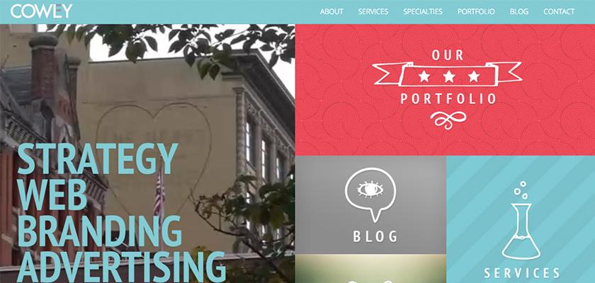
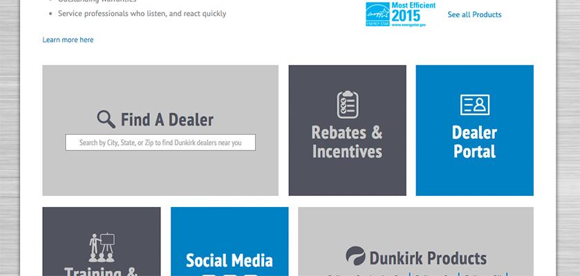
#2: Contained UncontainmentOne of the biggest trends of the past few years, and especially 2015, has been tiles, or shapes in general (hexagons have also been popular). Tiles and shapes keep images and text contained and provide a nice, simple layout to follow. This technique also plays well for a responsive web design because it creates buttons to tap on. As we get more sophisticated, we’re going to see what I like to call “contained uncontainment.” All this is, is an image popping out of that tile or shape. So, instead of everything contained, there’s an element that’s bursting out to give a 3D effect. This technique has been used for decades in print design, and it’s starting to become increasingly popular in web design. This trend also plays well with Trend #1. You’ll begin to see those uncontained designed elements being interactive and moving out of the contained areas.
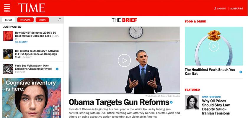
#3: Less Formal MenusWeb design for years and years, ever since it was created, has been confined by formal navigational menus at the top or side of the screen that listed out the major sections of the site. But, that is starting to fade away and we’ll begin to see a more rapid acceleration of its disappearance here in 2016. What we’re going to see is a hamburger icon in the top left or right hand corner of the screen that will have a menu fly out from the side (usually) when it’s clicked on. There are many reasons someone will do this, but two in particular. 1: It’s a cleaner layout and doesn’t clutter of the screen with more words. 2: It’s already mobile-friendly and a responsive design will be that much easier. We’ve seen heavy digital companies go this route, and even some news companies. But, we’ll start seeing more traditional companies do this simplified menu and go away from a classic navigation.
#4: No More Home ButtonThis trend has been slowly happening for awhile now, but we’re going to see almost everyone do this in 2016. They’re going to get rid of the menu item that says “home.” Why? Because no one needs it, users almost automatically know to click the company’s logo to go back to the home page. By removing the word “home” you not only free up space for another navigation item, but you also de-clutter the menu and give it more importance for finding information. Take a look at the next 5 or so websites you go to, you’ll notice more and more that the home button isn’t there. As internet users get more savvy and more efficient in their browsing, we’re going to see more trends like this happening.
#5: Tap-able AreasIt’s no secret that everything is going mobile and that certainly is our future. Mobile, responsive web design is now a mandatory feature needed and if your website isn’t responsive or mobile-friendly yet, you’re seriously missing out! So, when a web designer builds for the desktop, they have to think about the mobile experience as well. That’s why everything will become tap-able areas and be big enough to touch for even the people with fat fingers.
ConclusionHere’s what I see as the five hottest trends we’ll see in web design this year. It’s going to be all about keeping users entertained and continuing to play nice on mobile devices. Having a website isn’t just about “being there” anymore! |
 Stay InTOUCHSign up here to get our monthly newsletter and blog updates. |

