
Client Spotlight: Roerden Law
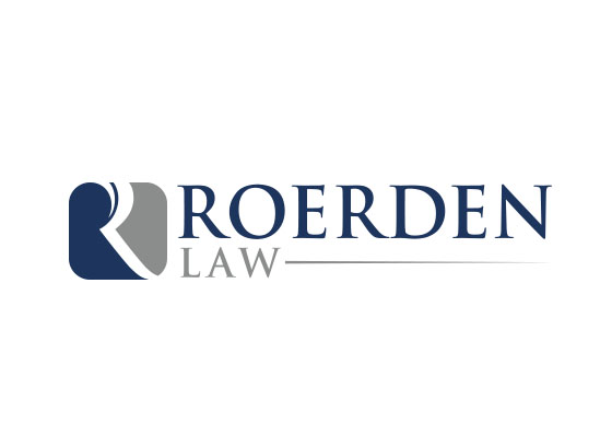
Cowley recently had the pleasure of working with Tom Roerden, who owns his own law practice, Roerden Law. He came to us during a time of transition. He was moving offices and was using that opportunity as a symbol to start fresh with his branding. After a meeting to learn all that it is Mr. Roerden does, we set out with the clear task of creating a new look and identity that was modern, clean, and, of course, creative. A New IdentityOne of the first things we did was brainstormed concepts for Roerden Law’s new logo. It had to be representative of him, clean in color, and most importantly, beautifully modern. That led us to what he has now. It’s a simple icon with a subliminal “R” showcasing two very professional, clean colors of blue and gray. We put his name large and clearly readable to anyone looking at it. A Tagline That FitsDuring the logo design process, we were also coming up with a new tagline for Roerden. It had to be something simple, but yet it had to be relevant and personalized to him. We came up with “Personal Attention. Professional Results.” The first half of the tagline gets at the core of what he offers as an attorney. He will personally represent you in your case instead you being handed off to an associate as with bigger law firms. The second half of the tagline goes for his results-oriented nature. He wants to make sure each and every one of his clients is getting the results they deserve when using his services. Everyone Came Out HappyBoth Roerden and ourselves are extremely pleased with how this identity came out. Mr. Roerden is now using it across all of his marketing materials including folders, business cards, stationary, etc. He also was so pleased with the work we did on his logo, we are now doing his website, too! It is in development as we speak, but you can learn more about Roerden Law and his services at www.roerdenlaw.com. |
Stay InTOUCHSign up here to get our monthly newsletter and blog updates. |